page.title=Hello, Form Stuff
parent.title=Hello, Views
parent.link=index.html
@jd:body
This page introduces a variety of widgets, like image buttons,
text fields, checkboxes and radio buttons.
- Start a new project/Activity called HelloFormStuff.
- Your layout file should have a basic LinearLayout:
<?xml version="1.0" encoding="utf-8"?>
<LinearLayout xmlns:android="http://schemas.android.com/apk/res/android"
    android:orientation="vertical"
    android:layout_width="fill_parent"
    android:layout_height="fill_parent" >

</LinearLayout>
For each widget you want to add, just put the respective View inside here.
Tip: As you add new Android code, press Ctrl(or Cmd) + Shift + O
to import all needed packages.
ImageButton
A button with a custom image on it.
We'll make it display a message when pressed.
 Drag the Android image on the right (or your own image) into the
res/drawable/ directory of your project.
We'll use this for the button.
Drag the Android image on the right (or your own image) into the
res/drawable/ directory of your project.
We'll use this for the button.- Open the layout file and, inside the LinearLayout, add the {@link android.widget.ImageButton} element:
<ImageButton
    android:id="@+id/android_button"
    android:layout_width="100dip"
    android:layout_height="wrap_content"
    android:src="@drawable/android" />
The source of the button
is from the res/drawable/ directory, where we've placed the android.png.
Tip: You can also reference some of the many built-in
images from the Android {@link android.R.drawable} resources,
like ic_media_play, for a "play" button image. To do so, change the source
attribute to android:src="@android:drawable/ic_media_play".
- To make the button to actually do something, add the following
code at the end of the
onCreate() method:
final ImageButton button = (ImageButton) findViewById(R.id.android_button);
button.setOnClickListener(new OnClickListener() {
    public void onClick(View v) {
        // Perform action on clicks
        Toast.makeText(HelloFormStuff.this, "Beep Bop", Toast.LENGTH_SHORT).show();
    }
});
This captures our ImageButton from the layout, then adds an on-click listener to it.
The {@link android.view.View.OnClickListener} must define the onClick() method, which
defines the action to be made when the button is clicked. Here, we show a
{@link android.widget.Toast} message when clicked.
- Run it.
EditText
A text field for user input. We'll make it display the text entered so far when the "Enter" key is pressed.
- Open the layout file and, inside the LinearLayout, add the {@link android.widget.EditText} element:
<EditText
    android:id="@+id/edittext"
    android:layout_width="fill_parent"
    android:layout_height="wrap_content"/>
- To do something with the text that the user enters, add the following code
to the end of the
onCreate() method:
final EditText edittext = (EditText) findViewById(R.id.edittext);
edittext.setOnKeyListener(new OnKeyListener() {
    public boolean onKey(View v, int keyCode, KeyEvent event) {
        if ((event.getAction() == KeyEvent.ACTION_DOWN) && (keyCode == KeyEvent.KEYCODE_ENTER)) {
          // Perform action on key press
          Toast.makeText(HelloFormStuff.this, edittext.getText(), Toast.LENGTH_SHORT).show();
          return true;
        }
        return false;
    }
});
This captures our EditText element from the layout, then adds an on-key listener to it.
The {@link android.view.View.OnKeyListener} must define the onKey() method, which
defines the action to be made when a key is pressed. In this case, we want to listen for the
Enter key (when pressed down), then pop up a {@link android.widget.Toast} message with the
text from the EditText field. Be sure to return true after the event is handled,
so that the event doesn't bubble-up and get handled by the View (which would result in a
carriage return in the text field).
- Run it.
CheckBox
A checkbox for selecting items. We'll make it display the the current state when pressed.
- Open the layout file and, inside the LinearLayout, add the {@link android.widget.CheckBox} element:
<CheckBox android:id="@+id/checkbox"
    android:layout_width="wrap_content"
    android:layout_height="wrap_content"
    android:text="check it out" />
- To do something when the state is changed, add the following code
to the end of the
onCreate() method:
final CheckBox checkbox = (CheckBox) findViewById(R.id.checkbox);
checkbox.setOnClickListener(new OnClickListener() {
    public void onClick(View v) {
        // Perform action on clicks
        if (checkbox.isChecked()) {
            Toast.makeText(HelloFormStuff.this, "Selected", Toast.LENGTH_SHORT).show();
        } else {
            Toast.makeText(HelloFormStuff.this, "Not selected", Toast.LENGTH_SHORT).show();
        }
    }
});
This captures our CheckBox element from the layout, then adds an on-click listener to it.
The {@link android.view.View.OnClickListener} must define the onClick() method, which
defines the action to be made when the checkbox is clicked. Here, we query the current state of the
checkbox, then pop up a {@link android.widget.Toast} message that displays the current state.
Notice that the CheckBox handles its own state change between checked and un-checked, so we just
ask which it currently is.
- Run it.
Tip: If you find that you need to change the state
in another way (such as when loading a saved {@link android.preference.CheckBoxPreference}),
use setChecked(true) or toggle().
RadioButton
Two mutually-exclusive radio buttons—enabling one disables the other.
When each is pressed, we'll pop up a message.
- Open the layout file and, inside the LinearLayout, add two {@link android.widget.RadioButton}s,
inside a {@link android.widget.RadioGroup}:
<RadioGroup
  android:layout_width="fill_parent"
  android:layout_height="wrap_content"
  android:orientation="vertical">

  <RadioButton android:id="@+id/radio_red"
      android:layout_width="wrap_content"
      android:layout_height="wrap_content"
      android:text="Red" />

  <RadioButton android:id="@+id/radio_blue"
      android:layout_width="wrap_content"
      android:layout_height="wrap_content"
      android:text="Blue" />

</RadioGroup>
- To do something when each is selected, we'll need an OnClickListener. Unlike the other
listeners we've created, instead of creating this one as an anonymous inner class,
we'll create it as a new object. This way, we can re-use the OnClickListener for
both RadioButtons. So, add the following code in the HelloFormStuff Activity
(outside the
onCreate() method):
OnClickListener radio_listener = new OnClickListener() {
    public void onClick(View v) {
        // Perform action on clicks
        RadioButton rb = (RadioButton) v;
        Toast.makeText(HelloFormStuff.this, rb.getText(), Toast.LENGTH_SHORT).show();
    }
};
Our onClick() method will be handed the View clicked, so the first thing to do
is cast it into a RadioButton. Then we pop up a
{@link android.widget.Toast} message that displays the selection.
- Now, at the bottom of the
onCreate() method, add the following:
  final RadioButton radio_red = (RadioButton) findViewById(R.id.radio_red);
  final RadioButton radio_blue = (RadioButton) findViewById(R.id.radio_blue);
  radio_red.setOnClickListener(radio_listener);
  radio_blue.setOnClickListener(radio_listener);
This captures each of the RadioButtons from our layout and adds the newly-created
OnClickListener to each.
- Run it.
Tip: If you find that you need to change the state of a
RadioButton in another way (such as when loading a saved {@link android.preference.CheckBoxPreference}),
use setChecked(true) or toggle().
ToggleButton
A button used specifically for toggling something on and off.
- Open the layout file and, inside the LinearLayout, add the {@link android.widget.ToggleButton} element:
<ToggleButton android:id="@+id/togglebutton"
    android:layout_width="wrap_content"
    android:layout_height="wrap_content" />
- To do something when the state is changed, add the following code
to the end of the
onCreate() method:
final ToggleButton togglebutton = (ToggleButton) findViewById(R.id.togglebutton);
togglebutton.setOnClickListener(new OnClickListener() {
    public void onClick(View v) {
        // Perform action on clicks
        if (togglebutton.isChecked()) {
            Toast.makeText(HelloFormStuff.this, "ON", Toast.LENGTH_SHORT).show();
        } else {
            Toast.makeText(HelloFormStuff.this, "OFF", Toast.LENGTH_SHORT).show();
        }
    }
});
This captures our ToggleButton element from the layout, then adds an on-click listener to it.
The {@link android.view.View.OnClickListener} must define the onClick() method, which
defines the action to be made when the button is clicked. Here, we query the current state of the
ToggleButton, then pop up a {@link android.widget.Toast} message that displays the current state.
Notice that the ToggleButton handles its own state change between checked and un-checked, so we just
ask which it is.
- Run it.
Tip: By default, the text on the button is "ON" and "OFF", but
you can change each of these with setTextOn(CharSequence) and
setTextOff(CharSequence). And, if you find that you need to change the state
in another way (such as when loading a saved {@link android.preference.CheckBoxPreference}),
use setChecked(true) or toggle().
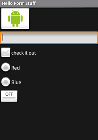
If you've added all the form items above, your application should look something like this:
References
- {@link android.widget.ImageButton}
- {@link android.widget.EditText}
- {@link android.widget.CheckBox}
- {@link android.widget.RadioButton}
- {@link android.widget.ToggleButton}