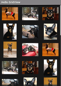
{@link android.widget.GridView} is a {@link android.view.ViewGroup} that displays items in a two-dimensional, scrollable grid. The grid items are automatically inserted to the layout using a {@link android.widget.ListAdapter}.
In this tutorial, you'll create a grid of image thumbnails. When an item is selected, a toast message will display the position of the image.
res/drawable/ directory.res/layout/main.xml file and insert the following:
<?xml version="1.0" encoding="utf-8"?>
<GridView xmlns:android="http://schemas.android.com/apk/res/android"
    android:id="@+id/gridview"
    android:layout_width="fill_parent"
    android:layout_height="fill_parent"
    android:columnWidth="90dp"
    android:numColumns="auto_fit"
    android:verticalSpacing="10dp"
    android:horizontalSpacing="10dp"
    android:stretchMode="columnWidth"
    android:gravity="center"
/>
This {@link android.widget.GridView} will fill the entire screen. The attributes are rather self explanatory. For more information about valid attributes, see the {@link android.widget.GridView} reference.
HelloGridView.java and insert the following code for the
{@link android.app.Activity#onCreate(Bundle) onCreate()} method:
public void onCreate(Bundle savedInstanceState) {
    super.onCreate(savedInstanceState);
    setContentView(R.layout.main);

    GridView gridview = (GridView) findViewById(R.id.gridview);
    gridview.setAdapter(new ImageAdapter(this));

    gridview.setOnItemClickListener(new OnItemClickListener() {
        public void onItemClick(AdapterView<?> parent, View v, int position, long id) {
            Toast.makeText(HelloGridView.this, "" + position, Toast.LENGTH_SHORT).show();
        }
    });
}
After the {@code main.xml} layout is set for the content view, the {@link android.widget.GridView} is captured from the layout with {@link android.app.Activity#findViewById(int)}. The {@link android.widget.GridView#setAdapter(T) setAdapter()} method then sets a custom adapter ({@code ImageAdapter}) as the source for all items to be displayed in the grid. The {@code ImageAdapter} is created in the next step.
To do something when an item in the grid is clicked, the {@link android.widget.AdapterView#setOnItemClickListener(OnItemClickListener) setOnItemClickListener()} method is passed a new {@link android.widget.AdapterView.OnItemClickListener}. This anonymous instance defines the {@link android.widget.AdapterView.OnItemClickListener#onItemClick(AdapterView,View,int,long) onItemClick()} callback method to show a {@link android.widget.Toast} that displays the index position (zero-based) of the selected item (in a real world scenario, the position could be used to get the full sized image for some other task).
ImageAdapter that extends {@link
android.widget.BaseAdapter}:
public class ImageAdapter extends BaseAdapter {
    private Context mContext;

    public ImageAdapter(Context c) {
        mContext = c;
    }

    public int getCount() {
        return mThumbIds.length;
    }

    public Object getItem(int position) {
        return null;
    }

    public long getItemId(int position) {
        return 0;
    }

    // create a new ImageView for each item referenced by the Adapter
    public View getView(int position, View convertView, ViewGroup parent) {
        ImageView imageView;
        if (convertView == null) {  // if it's not recycled, initialize some attributes
            imageView = new ImageView(mContext);
            imageView.setLayoutParams(new GridView.LayoutParams(85, 85));
            imageView.setScaleType(ImageView.ScaleType.CENTER_CROP);
            imageView.setPadding(8, 8, 8, 8);
        } else {
            imageView = (ImageView) convertView;
        }

        imageView.setImageResource(mThumbIds[position]);
        return imageView;
    }

    // references to our images
    private Integer[] mThumbIds = {
            R.drawable.sample_2, R.drawable.sample_3,
            R.drawable.sample_4, R.drawable.sample_5,
            R.drawable.sample_6, R.drawable.sample_7,
            R.drawable.sample_0, R.drawable.sample_1,
            R.drawable.sample_2, R.drawable.sample_3,
            R.drawable.sample_4, R.drawable.sample_5,
            R.drawable.sample_6, R.drawable.sample_7,
            R.drawable.sample_0, R.drawable.sample_1,
            R.drawable.sample_2, R.drawable.sample_3,
            R.drawable.sample_4, R.drawable.sample_5,
            R.drawable.sample_6, R.drawable.sample_7
    };
}
First, this implements some required methods inherited from {@link android.widget.BaseAdapter}. The constructor and {@link android.widget.Adapter#getCount()} are self-explanatory. Normally, {@link android.widget.Adapter#getItem(int)} should return the actual object at the specified position in the adapter, but it's ignored for this example. Likewise, {@link android.widget.Adapter#getItemId(int)} should return the row id of the item, but it's not needed here.
The first method necessary is {@link android.widget.Adapter#getView(int,View,ViewGroup) getView()}. This method creates a new {@link android.view.View} for each image added to the {@code ImageAdapter}. When this is called, a {@link android.view.View} is passed in, which is normally a recycled object (at least after this has been called once), so there's a check to see if the object is null. If it is null, an {@link android.widget.ImageView} is instantiated and configured with desired properties for the image presentation:
If the {@link android.view.View} passed to {@link android.widget.Adapter#getView(int,View,ViewGroup) getView()} is not null, then the local {@link android.widget.ImageView} is initialized with the recycled {@link android.view.View} object.
At the end of the {@link android.widget.Adapter#getView(int,View,ViewGroup) getView()} method, the {@code position} integer passed into the method is used to select an image from the {@code mThumbIds} array, which is set as the image resource for the {@link android.widget.ImageView}.
All that's left is to define the {@code mThumbIds} array of drawable resources.
Your grid layout should look something like this:

Try experimenting with the behaviors of the {@link android.widget.GridView} and {@link android.widget.ImageView} elements by adjusting their properties. For example, instead of using {@link android.view.View#setLayoutParams(ViewGroup.LayoutParams)}, try using {@link android.widget.ImageView#setAdjustViewBounds(boolean)}.